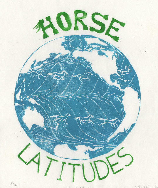
It is printed by hand on lovely Japanese kozo (or mulberry paper), 11 inches by 12.5 inches (27.9 cm by 31.8 cm), in an edition of 12.
I carved a view of the hemisphere, complete with all the islands and continents in reverse, showing the major trade wind patterns. The winds travel consistently east to west along the hot equator, west to east in high latitudes like the 'roaring 40s', but at the horse latitudes, between 30 and 35 degrees, both north and south, in the region of the subtropical highs known as the horse latitudes, things are not so predictable. It is consistently warm and dry, but winds are variable, which, once upon a time, could be terrifying to sailors. I've illustrated the horse latitudes with actual little horses, galloping around the planet. Since this this print is about the sea, it is the oceans which are 'positive' (printed in ink) and the land which is the negative space. Sometimes we look at the oceans as the space which separates the land masses, but it is possible to have the opposite view or consider the oceans as what connects us all. I love the unexpectedness of this name, and playing with words.
The origins of the term are debated. Some claim that the name comes from sailor's "dead horse" ritual, during which they would beat a straw effigy of a horse and then throw it overboard; they did this to celebrate having worked off their "dead horse time" (the period they were in debt to the paymaster, since they spent their advance pay too quickly, ending up broke by the time a westbound ship from Europe could reach the horse latitudes). Others claim that Spanish colonial ships to the New World, laden with horses, would risk being becalmed in the doldrums or horse latitudes, and when fresh water ran scarce, the horses were the first to go (though this might be a mere folk legend).
The typography of the word horse is designed to suggest the animal, with its mane and hooves. The horses themselves are inspired by Muybridge's early photos, showing their motion. I've also very specifically chosen the view of our Earth. We have many biases in maps; we expect north to be up, but that's arbitrary, and here in North America we expect to see the Americas on the left (because we read left to right). But, in this print, it's all about the Pacific, so it goes in the middle.
I'm really proud of writing that description without feeling compelled to try and first explain about Hadley cells. That took restraint.

No comments:
Post a Comment